Showing posts with label color throwdown. Show all posts

Wednesday, January 5, 2022

Color Throwdown 674


Cheers, 2022 and to our first Color Throwdown Challenge of the year. Amy's got a black tie color combination to ring in the new year - black, gold and white. Have fun and thanks for playing along!

If you upload to a public gallery please use the keyword CTD674, and please use #ctd674 and #colorthrowdown on social media sites.  Also, when linking up your card using the linky tool at the bottom of this post, please be sure to use a link to your specific post, not just a generic link to your blog.  And remember only paper creations are allowed.


I went simple and classic and inked up the Snowflake Season stamps in Midnight ink. The sentiment is the FREE WITH PURCHASE set called Snowy Sentiments. I added a strip of gold glittler card stock and then tucked in a few silver sequins. 

Easy Peasy! Perfect for all those holiday thank-yous we all need to send. Today kicks off the Countdown to Confetti for our January Release on the 8th!


Wednesday, November 17, 2021

Color Throwdown no. 669


 Good Wednesday morning!!! Vickie is our hostess for this week's Color Throwdown Challenge #669! She picked this color combo as a little something different for Christmas colors- so this week we are playing with navy, gold, and white. I hope they inspire you to create something special. We are using generic colors, so as long as you use the color values shown, you are all set! As always, please feel free to incorporate any neutrals that you need in your design as well!


Here is my card with all Reverse Confetti products.
 Retro Holiday is so fun to play with.

 Come play along with us over at CTD!

Wednesday, October 13, 2021

Color Throwdown no. 664

Short and sweet today. You can catch all the details over on the CTD Blog. I adored these colors this week, Turquoise, kraft, & Brown. I am starting to feel a pull towards creating more holiday cards. I LOVE this Tree Confetti Cuts die. I added some Pattern Panels to the background. 


I pulled out a holiday set from last year, Holiday Boughs to accent it and bring in the turquoise color. I also added some sparkle with glitter paper and the Layered Peace Confetti Cut.


Thanks for stopping by today. Come check out the challenge. 


Wednesday, September 15, 2021

Color Throwdown no. 660


Hello everyone! Wanda has a new set of colors that I hope you will love as much as I do. This week's colors are navy, blue, green and orange.  I hope you have fun creating with them! Remember, we use generic colors, so as long as you use the color values shown, you are all set! Feel free to incorporate any neutrals that you would like in your design.

If you upload your creation to a public gallery, please use the key words CTD660, and please use #ctd660 and #colorthrowdown on social media sites. Also, when linking up your card using the linky tool at the bottom of this post, please use a direct link to your specific post, not a generic link to your blog. All the rules are in the right sidebar, so check them out if you're unsure. No digital designs will be allowed - only digital images that are printed off and colored.

Be sure to check out some great inspiration from the talented design team! We can't wait to see what you create! Color Throwdown


Here is my card for this week. I used the  recently released Simon Says Stamp Reverse Confetti STAMPtember set called Autumn Blessings. There are still in stock....but remember this is a limited release so don't miss out. 


Thanks for stopping by today. Have a great day!


Wednesday, February 24, 2021

Color Throwdown 631-Hello


Hello everyone! Amy Rysavy is this week's host for the  Throwdown challenge! She came across this gorgeous bedding/bedroom set while browsing Target online and loved the colors.

The colors for this week are to use turquoise, pink, rust and magenta. Remember we just use generic colors (so any brand/type/whatever you have will work) and you can always feel free to add in neutrals (white/black/etc) to make your creation pop!

If you upload your creation to a public gallery, please use the keyword CTD631, and please use #CTD631 and #colorthrowdown on social media so we can find your gorgeous creations!  When linking up your creation using the linky tool below, please be sure to link your specific post, not a general link to your blog.  All of the "rules" are in the right sidebar, and you can always check there to be sure!

One last detail to remember, no digital designs.  Only digital images that are printed off and colored will be allowed.  Totally digital designs will be removed from the link up.

Here's some fabulous inspiration from the rest of the CTD team to get y'all started!

I still have the amazing new  Reverse Confetti & Hero Arts collaboration stamp set, Better Together on my desk. So I couldn't help but use it for today's card. I created two beautiful blooms with the following RC inks: Rust, Piggy Bank, RC Aqua, and Wine. 


I made the card on a smaller scale, 4.25 square, and then framed it up with the Scalloped Square Confetti Cuts in Rust card stock. I used just a bit of the sentiment from Better Together and snipped off the word hello. The background is my favorite Diagonal Stitches Cove Panel. 


For more amazing projects with this week's colors, check out what my teamies created with these colors. 

We can't wait to see what you come up with this week.


Wednesday, January 27, 2021

Color Throwdown #627 Good Cheer!

Hi, everyone!  Lori picked our colors for this week’s Color Throwdown challenge.  The colors from this week's inspiration photo are pale pink, blue, and gray.  The colors are generic and it's fine if you want to add in other neutrals along with the challenge colors.  

Once you’ve finished your card or other paper crafting project using the colors, add a direct link to your creation using the linky tool at the bottom of the post.  And, don’t forget to use the keyword CTD627 if you upload your project to an online gallery. You can use the keywords #ctd627 and #colorthrowdown if you upload to any social media sites (yes, we're on Facebook, Instagram, and Twitter!).  All of the challenge "rules" are in the right sidebar in case you have any questions.  One last detail to remember, no digital designs.  Only digital images that are printed off and colored will be allowed.  Totally digital designs will be removed from the link up.

Before you head off to create, here’s some inspiration from our talented team to get you started.  The CTD team is looking forward to seeing what you create with these colors!


We are approaching birthday month in our house and I am starting early on my stash. I pulled out the adorable Bearing Gifts stamp set and started with some stenciling pink clouds with the Cloudy Days Cover Panel (just cut a panel and tape it down to use as a stencil. I cut mine from regular card stock and it works beautifully). 

I colored up with card in the light blue color for the challenge and kept the rest of the images in the grey tones. I add some ground detail with my copic markers. 

The sentiment was stamped in Stormy ink from the same Bearing Gifts set. 


For more amazing projects with this week's colors, check out what my teamies created with these colors. 

We can't wait to see what you come up with this week.


Wednesday, January 20, 2021

Color Throwdown 626-Hello Farmhouse Wreath


Hi y'all!  Lisa Henke for the Color Throwdown Challenge this week.

This is #626 and your colors for this week are Plum, Cream and Black. Remember, we are using generic colors, so as long as you use the color values shown, you will be just fine! This is all about having fun so don't worry if you don't have the exact hues shown here. And you can incorporate any neutrals you need into your design as well.

If you upload to a public gallery, please use the key word CTD626. Use #ctd626 and #colorthrowdown on social media sites. Link up your card using the linky tool at the bottom of this post and please link to your specific post, not a generic link to your blog..

Here is my card for this week's colors. I used the beautiful Farmhouse Wreath stamp set from Reverse Confetti. I love that there are extra floral images that you can use to create a beautiful background. I was looking for a wallpaper-like feel, yet didn't want it to over power the card, so I stuck with Midnight ink stamped on Cloud White Card stock. I layered that over top of some polka dotted paper from an old 6x6 paper pad, Darling Dots. 


I stamped the wreath image onto cloud white cardstock and and Midnight ink and then used my Zig markers to do some simple water coloring. I an extra bow and floral  and use the matching Farmhouse Wreath Confetti Cuts to cut them out. I adhere them with some foam dots for extra dimension. 


I went back and forth on how I wanted to do the sentiment and decided on a Midnight layered hello word die from the Hello & Thanks Label.


Thanks for stopping by. for more amazing projects with this week's colors, check out my teamies. 
Now let's see what the design team has created for your inspiration!
We can't wait to see what you come up with this week.


Wednesday, January 13, 2021

Color Throwdown 625- Snowflakes & Bunnies

Susie is here as our hostess for the Color Throwdown Challenge. We are so excited she has joined the team. 

This is #625 and your colors for this week are blue, pink and green. Remember, we are using generic colors, so as long as you use the color values shown, you will be just fine! This is all about having fun so don't worry if you don't have the exact hues shown here. And you can incorporate any neutrals you need into your design as well. 

If you upload to a public gallery, please use the key word CTD625. Use #ctd625 and #colorthrowdown on social media sites. Link up your card using the linky tool at the bottom of this post and please link to your specific post, not a generic link to your blog. 

I had some fun with the Brand New Catherine Pooler Inks on today's card. Thank-you to CP for allowing me to help sneak peek them.  They are so beautiful and I am excited to share them with you today. I used the Serenade, Ink the Park, and Pucker Up inks for my snowflakes and they were perfect for this week's colors.  The Bunny Slopes stamp set is full of adorable images and sweet little sentiments. 

I colored up the bunny couple with copics and added the sentiment in Midnight ink to the center of the card. 


Now let's see what the design team has created for your inspiration!
We can't wait to see what you come up with this week.

Wednesday, December 9, 2020

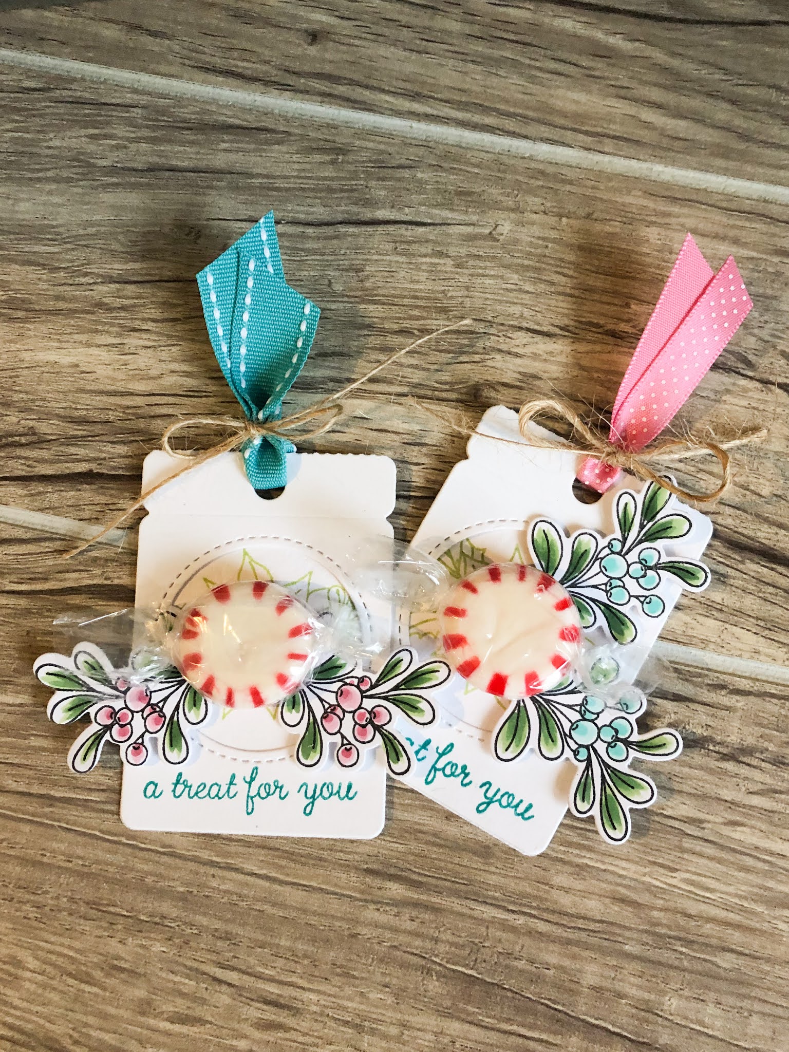
Color Throwdown 623-Peppermint Treat Tags


Hello, everyone!  Broni is here as our hostess for the LAST challenge of 2020.  I think I'm ready for this year to turn over into a new one, how about you??

For our challenge this week, the generic colors are Green, Aqua, and Pink.  Pretty simple, and this combo can be used for Christmas or anything else your heart desires.

If you upload to a public gallery please use the keyword CTD623, and please use #ctd623 and #colorthrowdown on social media sites.  Also, when linking up your card using the linky tool at the bottom of this post, please be sure to use a link to your specific post, not just a generic link to your blog.  And remember only paper creations are allowed.

I used some Reverse Confetti products (shocker, I. know! lol)  to make these sweet little peppermint tag treats. Kept it simple and love the Fold Over Window Tag Confetti Cut. The circle opening was perfect to tuck in the peppermint with a little glue dot. 


For more inspiration, check out the design team members' creations below, and get inky! We can't wait to see what you come up with this week.


Wednesday, August 12, 2020

Color Throwdown 606-Corgi Fun


Hello, Hello CTD fans! I have the honor of being your hostess for this week's colors. I hope you love the soft pretty summer pallet I picked for you- Peach, Aqua, and Kraft. That beach scene and bike are calling my name. Oh, what I wouldn't give for a little vitamin sea! 

If you upload to a public gallery, please use keyword CTD606, and please use #ctd606 and #colorthrowdown on social media. When linking your card to the winky tool at the bottom of this post, please be sure to link to your specific card, not just the generic link to your blog. Finally, only paper creations are allowed. Complete rules cam be found in the sidebar if you're unsure of challenge guidelines or are new to our challenge blog. I cannot wait to see what you all create!


I was feeling playful with that bike being some inspiration, and for some reason I reached for this adorable set from Reverse Confetti. It's called Corgi Cuties. I colored him up and gave him a fun aqua colored ball.

 I then tucked in a few clouds from the Cloudy Day Confetti CUTS


I created the background, sky, in peachy tones with some ink blending of Bellini ink. I splattered on some rust for added texture. The sentiment was stamped in Midnight ink along the top of the card base. 


Check out what the team has created this week!

Here is the team. I love what they created and you will too. 
Check them out. 

Wednesday, July 15, 2020

Color Throwdown


Hi, everyone! It's time for a new challenge! Barbara is our hostess for this week's  colors for this week. Remember, we're using generic colors, so as long as you use the color values shown: blue, green, peach, and metallic gold you'll be good...the color police won't come after you--this is all about having fun! And, feel free to incorporate any other neutrals you need in your design, as well. 

If you upload to a public gallery, please use the key words CTD602, and please use #ctd602 and #colorthrowdown on social media sites. Also, when linking up your card using the linky tool at the bottom of the post, please link to your specific post, not a generic link to your blog--all of the "rules" are in the right sidebar, so check 'em out to be sure. Importantly, though, no digital designs, only digital images that are printed off and colored will be allowed. Totally digital designs will be removed from the link up. 

I used a brand new stencil just released from Picket Fence Studios. I used the challenge colors and a Life Changing Blender brush to add in all the pretty colors. The release is full of fall and Christmas stamps but I wanted to ink up this new Shading Flower Stencil. It's a beautiful image and makes beautiful cards. I have two cards, one with bright cheerful colors and another one monochromatic . 

 I inked up the flower with Salty Ocean, Dried Marigold, and Mowed Lawn Distress inks. I used post-it notes to cover up areas I didn't want to transfer other colors to. The Life Changing Blender Brushes make the ink blending easy and quick. Once the ink was dry, I added a sentiment from More Fancy Sentiments with Intense Black Ink. 


I added some gold splatter with Golden Rose Paper Glaze. I added a bit of water to thin it out and then flicked it on to my card base with a paint brush. I finished it off with a little more shimmer thanks to Spiced Cider Sequin Mix.  


Wednesday, July 8, 2020

Color Throwdown 601/ To Brighten Your Day


Hello everyone! Amy Rysavy is our host for week's Color Throwdown challenge! 
The colors for this week are to use Orange, Burgundy, Green and Pink. Remember we just use generic colors (so any brand/type/whatever you have will work) and you can always feel free to add in neutrals (white/black/etc) to make your creation pop!

If you upload your creation to a public gallery, please use the keyword CTD601, and please use #CTD601 and #colorthrowdown on social media so we can find your gorgeous creations!  When linking up your creation using the linky tool below, please be sure to link your specific post, not a general link to your blog.  All of the "rules" are in the right sidebar, and you can always check there to be sure!


It is an exciting day! It is the Reverse Confetti July Release day. I was excited to get to use a handful of new products on my card for this week's challenge. I loved the earthy feel of the color combo, so the Multi-step Cacti stamp set was perfect. I inked up all the bits and used the Mulit-Step Cacti Confetti cuts to cut them out.  I added some texture to the background with the Pointed Cover Panel and added a touch of water color to with some distress oxide ink. 


The sentiment is from the new Best Sentiments. I love the mix of fonts and sizes. it makes it so modern. I also LOVE the new Background Builder. I used the solid stripe in Rust and Wine to add a bold border along the bottom of my main image panel. 


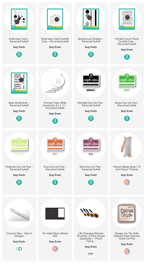
Here is closer look at the new products I used today that will be releasing today!