It’s time for our MFT Creative Challenge. Wait for it…..NO
Pattern Paper! YIKES!! Sounds scary, doesn’t it? I was worried about this one.
I mean come on, most of us paper crafting people are also paper loving people.
I mean, I just ordered 4 more 6x6 packs of paper the other day (can’t wait for
them to arrive!!!) and there are at
least 4 more that I can’t wait to order when they get to the stores.
A challenge is a challenge and I embraced this one. Once I
dug in, it wasn’t scary at all. In fact
it was fun, to kind of go back to my stamping roots and remember what it was
like to just use card stock. AND heck….with all the fabulous stamps and Die-namics in the My Favorite Things Boutique, it's even easier.
I have a layout for you, today! Yes, I scrapped and I am pretty excited about it. I pulled out some pics of my little cuties from 3 years ago. Gosh, how time flies! I used a layout from Page Maps, this is one from March 2011.
I had fun mixing and matching lots of Die-namics on this layout. I used two of the MFT alphabets, the new HIGH-RISE ALPHABET LOWERCASE (for the word Pumpkins. I cut those letters from Jellybean cardstock) and BY THE LETTERS (for the word Little, cut from Hot Fudge card stock). It always looks great to mix up the fonts on a layout.
Up at the top I accented my title with the LARGE FANCY FLOURISH and the smalled PRIMITIVE PUMPKIN. I cut a few of those flourishes and cut them apart to tuck in bits and pieces all over my layout.
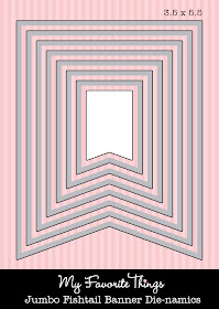
Across the middle of my layout. I added the new PICKET FENCE DIE-NAMICS. I cut two fences and attached them together to reach across the page. Along the fence I dressed it up with the JUMBO FISHTAIL BANNER and the FISHTAIL FLAGS STAX.
I used the cute background images from LOLLIPOP TREATS to stamp some pattern onto my orange FISHTAIL FLAG STAX.
A trick I use when not using pattern paper, add LOTS of texture. So I cut the JUMBO FISHTIAL BANNERS from burlap. It also fit into the fall theme of my page. I also used some corrugated cardboard to cut out my PRIMITIVE PUMPKINS (then I spritzed them with glimmer mist and Mister Huey's Calico White). I also dotted the page with some pretty Kraft buttons and the newest Hemp Twine.
An earthy color scheme with the Jellybean Green, Black Licorice, and Bannana split was an easy choice for me. I love earth tones. I softened the dark green with more of the Mister Huey's Calico White spray. I am getting braver with this stuff.
I cut two beautiful INSPIRED BY BUTTERFLIES and layered them with some foam dimensionals. I added some distressing to the edges, and prettied up the center with some chunky glitter, a Jellybean Green button, and some black twine.
The sentiment is from the BIG GREETINGS. I stamped it onto a RECTANGLE STAX 1 DIE-NAMICS and then distressed the edges to tie it in with my butterfly. I love my Antique Linen distress ink!! A big yellow seam binding ribbon finished this one off.
I decided to make one more card without any pattern paper and this time I got a little techy.
I used some of the trendy Washi tape I've had in my stash....I hope that wasn't cheating. ;) More lovely MFT card stock on this one: sweet tooth, steel grey, and grapesicle. Along with the washi tape, a button and twine was all I needed to accent this card.
UP, UP, AND AWAY. Love those hot air balloons. They are easy to work with, thanks to the matching dies and stamps. I used the JUMBO CLOUD STAX to create a mask and make the cool cloud background. I'll show you how below. I used dimesionals to pop up the balloon to make it look like it is floating.
1. Cut out the shape you want to use on your back ground. Here I used the JUMBO CLOUD STAX.
2. Use a low adhesive tape (I used a strip of washi tape) to hold your mask in place.
3. Using a sponge, dauber, or blending tool, go ahead and sponge a complementary color of ink to your cardstock. Working in circles, adding ink right up over the edge of your mask. Taking extra care to NOT move the mask.
Here I used Grapesicle card stock and sponged on some SU! Pale Plum ink. It is a bit darker than the cardstock, giving the clouds a lighter appearance.


wow...lots of terrific projects with no patterned paper...way to go Lisa!
ReplyDeleteWow Lisa! What a beautiful collection of projects! Love your layout with your sweet little ones! Both of your cards are so pretty!
ReplyDeleteLisa, all 3 projects are really pretty, but the scrapbook page is just amazing!
ReplyDeleteLook at you go girl! These are all AMAZING!!! I LOVE them all, but I have to tell you, that page with your boys is the BOMB!!! LOVE those banners and your boys are SO adorable!!!
ReplyDeleteI love each of these, but I love the layout!! SUCH cute boys and I love the mixture of fonts!
ReplyDeleteAwesome page, Lisa! I really like the burlap flags (and the cute pics, of course)! Great cards too! I'll have to remember how you inked the clouds!
ReplyDeleteOMGosh, Lisa, what gorgeousness!!! A scrapbooking page and 2 cards, you've been a busy lady!!! I adore your sweet page of the kids at the pumpkin patch...too cute...love the corrugated primitive pumpkins and all the details...gorgeous! The cards are fabulous too....LOVE the cloud masking tip that is brilliant!
ReplyDeleteHugs,t
Awesome layout. Love the burlap banners and all the details. Your cards are lovely.
ReplyDeleteCute page !! I think my favorite is the hot air balloon. Love the colors and simplicity of it. Great projects Lisa!!
ReplyDelete